JUMP’s Creative Challenge
Mind block happens to the best of us. Whilst working in a creative industry is great, it can be tricky to stay inspired, especially when our creativity is what we build JUMP’s reputation on so we can’t afford to be short of energy or ideas!

Let’s take a look at how each of our designers interpreted the branding brief:
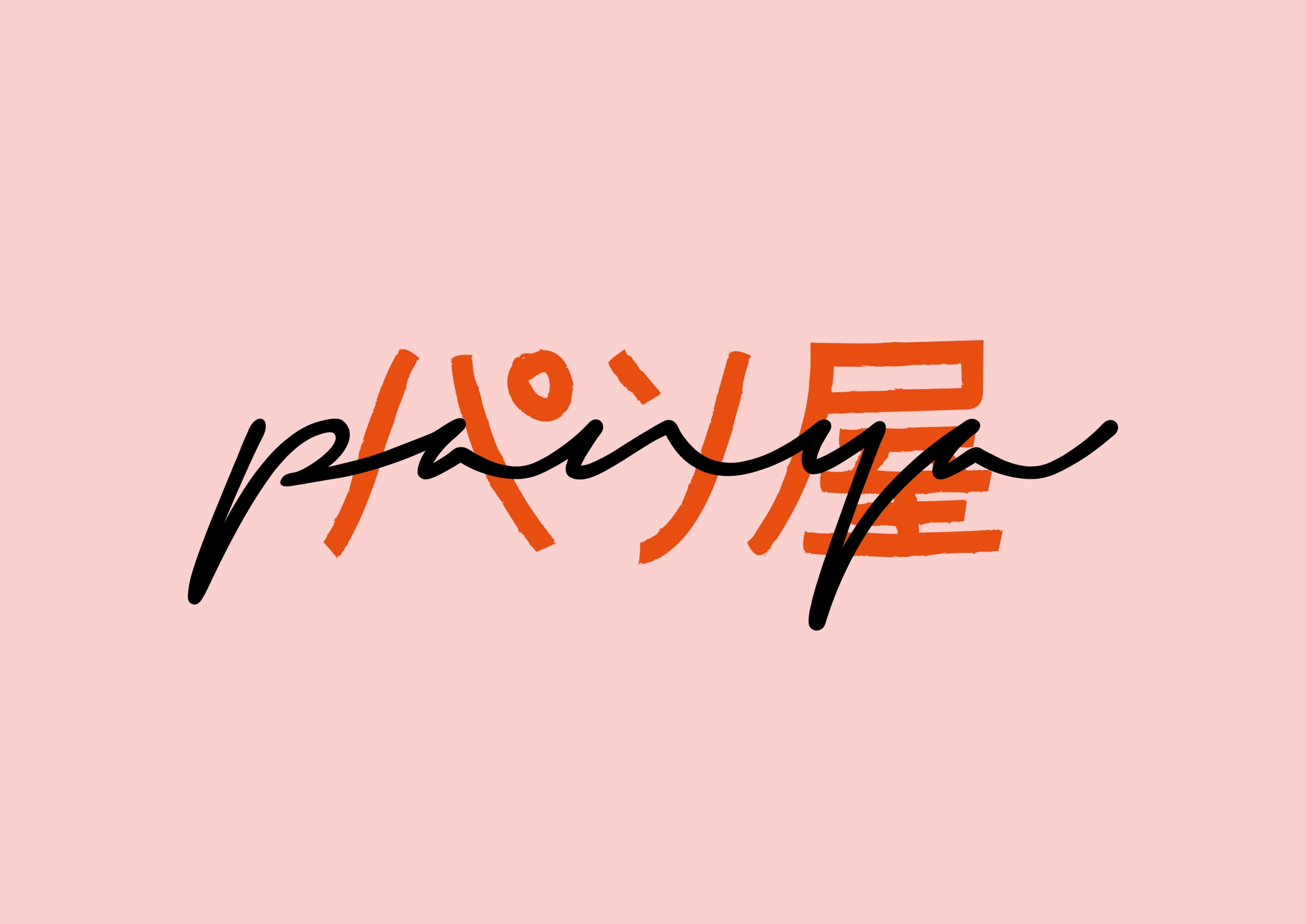
Panya by Hannah
Kiki’s Delivery Service by Studio Ghibli is one of our designer’s Hannah’s favourite films. The lead character Kiki, is a witch and runs a delivery service from Gütiokipänjä bakery.The name of the bakery is a pun; in Japanese, Guchokipa, means rock (gu), scissors (choki), paper (pa) and panya means bakery. Being a difficult word to read in our western culture, the bakery name was shortened to Panya.
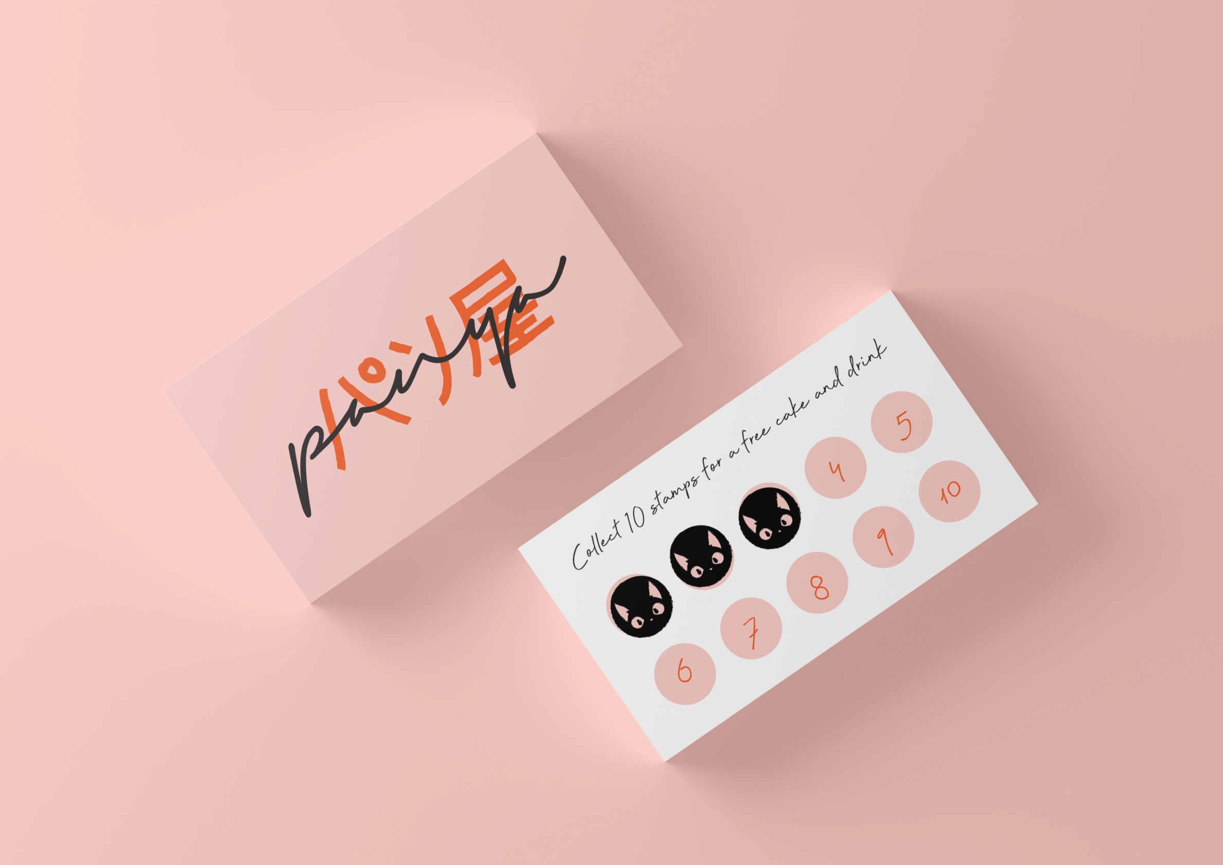
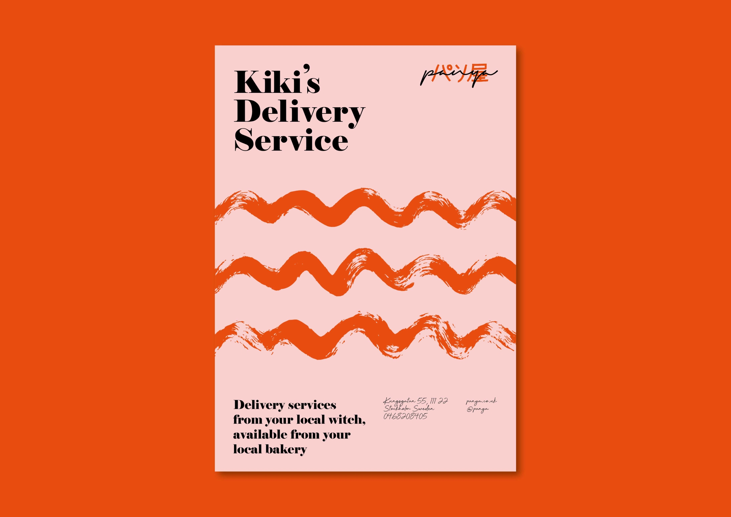
Enjoying painting, drawing, embroidery, weaving and all things craft in her free time, Hannah’s logo was inspired by calligraphy and was hand drawn and overlaid Japanese characters written in ink. The town from the film is based on Stockholm so a Swedish address is used on the business card whilst a Jiji the cat stamp is used for the loyalty card. The poster makes use of hand drawn ink lines which are a graphic representation of both the wind whilst Kiki flies her broom and jam in a cake!
Chez Villanelle by Danielle
Our UX Designer Danielle was inspired by the recent BBC drama Killing Eve and its quirky anti-hero Villanelle.
Villanelle is a beautiful young Russian woman with a fabulous wardrobe from Alexander McQueen to Chloé (the show’s costume department hand pick designer and vintage pieces to create her unique look). But she is also a psychopathic contract killer with a “creative” approach to her job. Danielle thought this was an interesting contrast to explore in a brand.
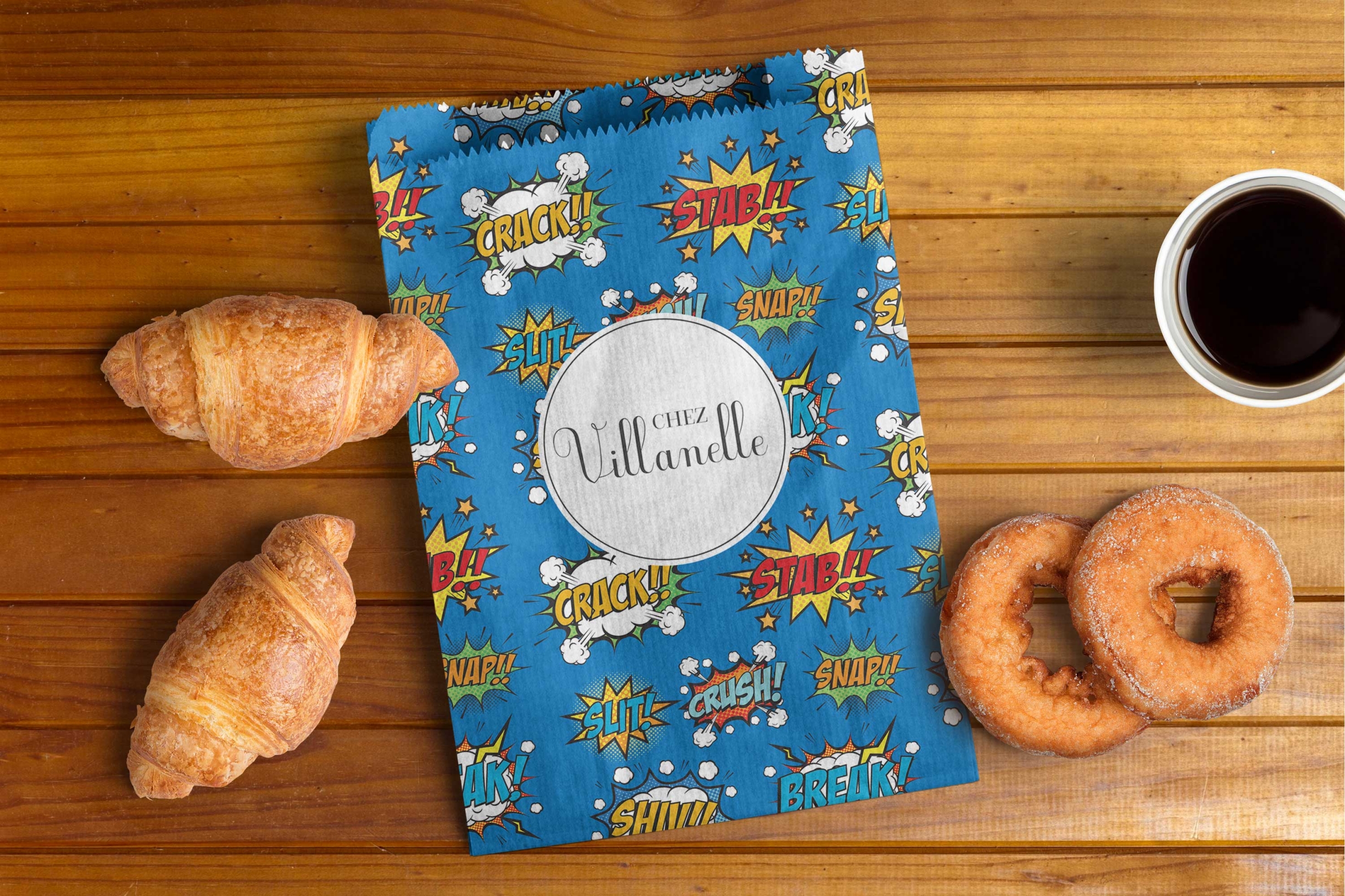
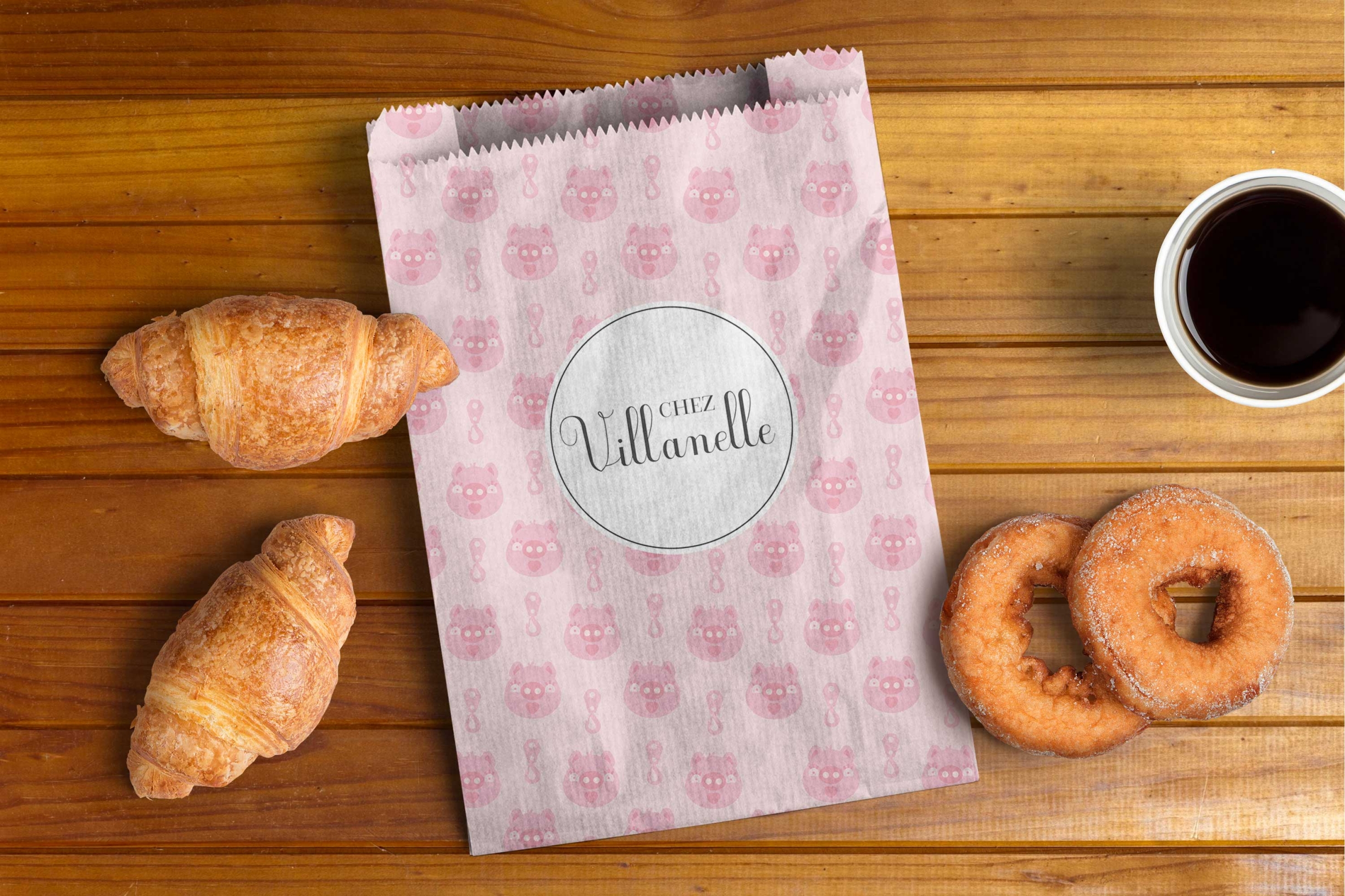
“If Villanelle opened a bakery it would definitely be in Paris as it would appeal to her sense of style” Danielle says. The Chez Villanelle logo is inspired by French cursive typography and traditional patisserie brands. The result; sweet and innocent. It’s the packaging design that introduces Villanelle’s dark side. Each paper bag pattern is inspired by one of Villanelle’s outfits, made to look like a fun pattern. Look closer, however, and you can see the twist on each pattern, as many characters discover of her character, things aren’t quite as innocent as they seem.
Alcremie by Adrian
Having a passion for all things Japanese and after a visit to Japan last year, our designer Adrian was hugely inspired. During the trip, Adrian noticed that almost all Japanese companies have mascots inspired by Kawai which is the culture of cuteness in Japan. He even noticed a fish restaurant had a lovable salmon character as a mascot and ended up buying some salmon-based merchandise for his young niece!
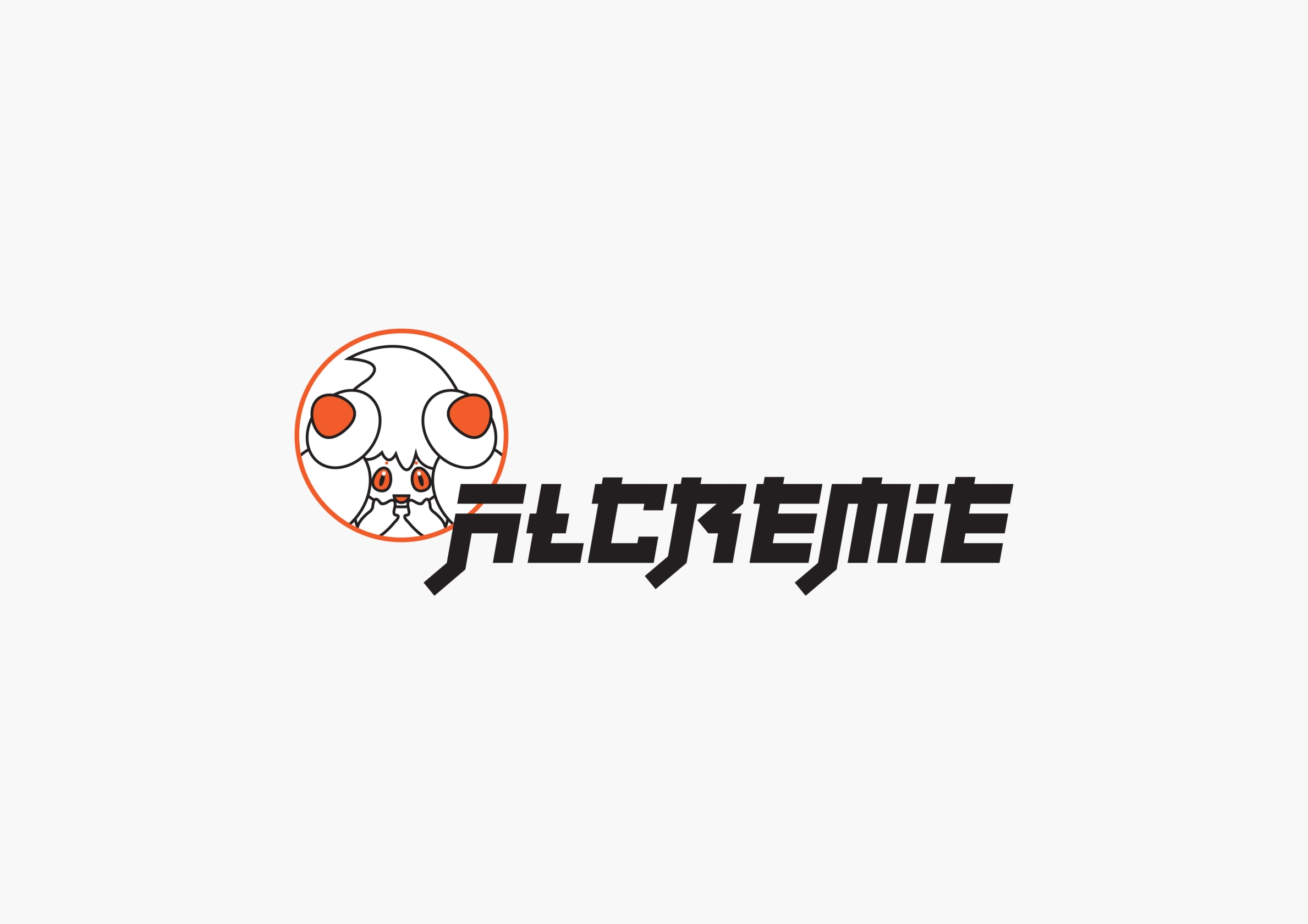
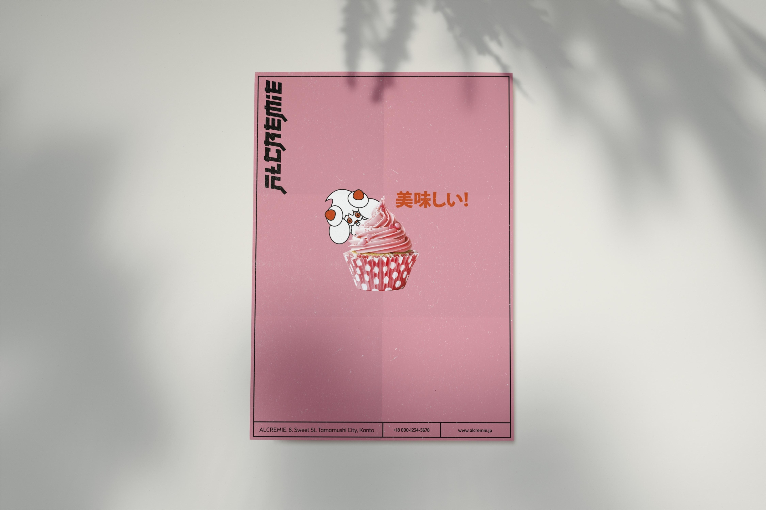
His dreams came true when he finally visited the Pokémon café in Tokyo. Pokémon’s upcoming release: Sword and Shield includes new character Alcremie, whose name is a combination of alchemy and cream/creamy. Alcremie’s appearance is meringue-like so this inspired Adrian to visualise how a bakery would look in the Pokémon world.

Pink Lane by Rachel
At first, designer Rachel considered doing something historically inspired in a vintage style but instead decided to set herself the challenge of learning something new in the process.
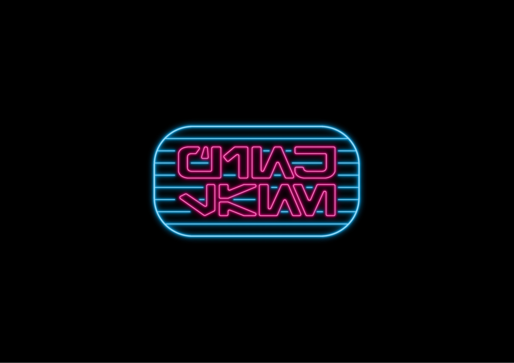
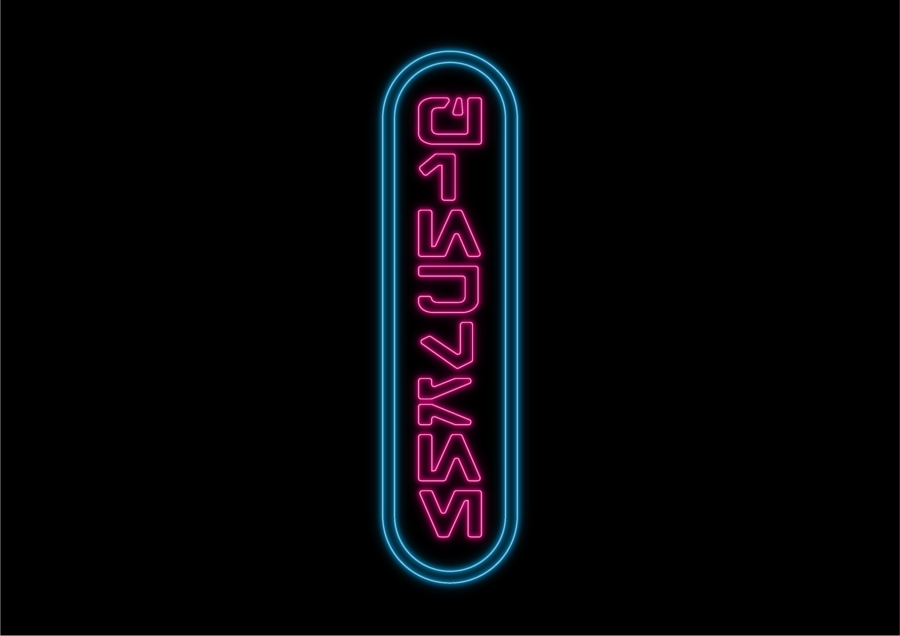
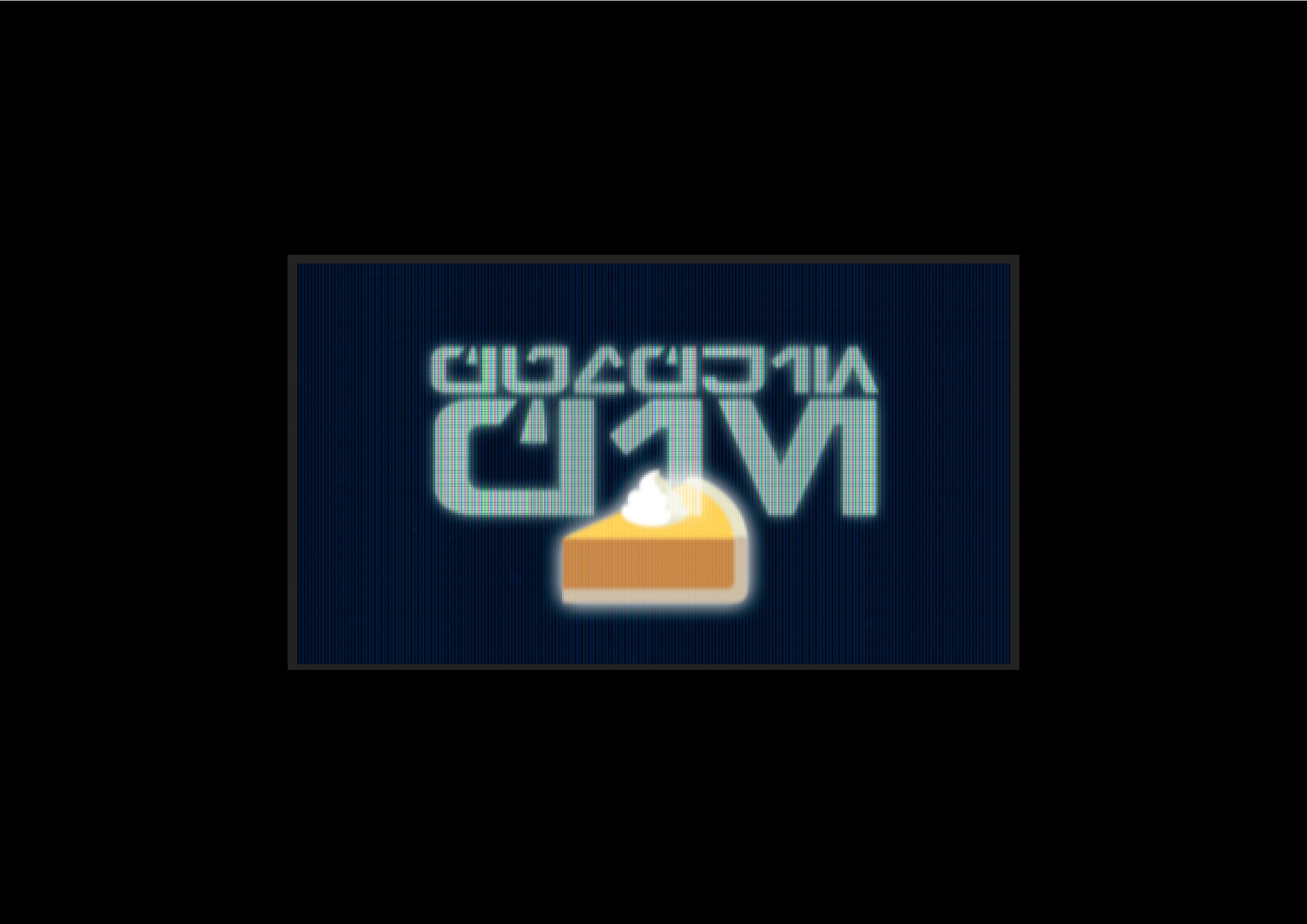
Inspired by her favourite films Blade Runner and Star Wars, Rachel’s bakery was set in a near dystopian future. Newcastle’s Pink Lane Bakery was the starting point in terms of a name but her logo uses Galactic Basic, the common language from Star Wars and the logo was visualised to look like neon lighting, a new skill Rachel learnt. A Japanese inspired vending machine was also visualised to dispense the baked goods in this futuristic brand.
Doughdays by Andy
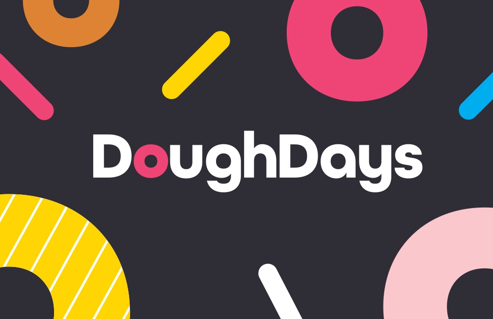
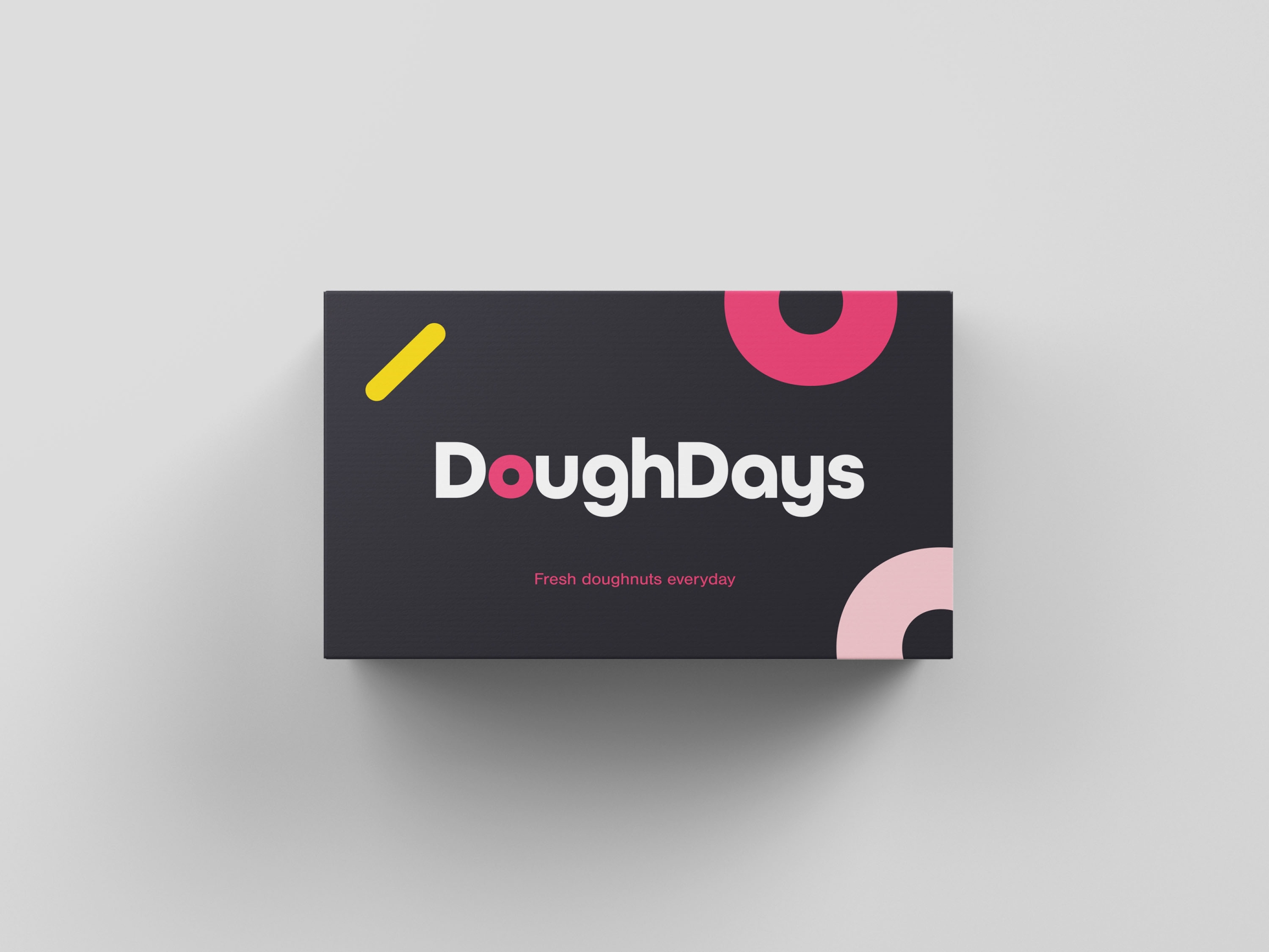
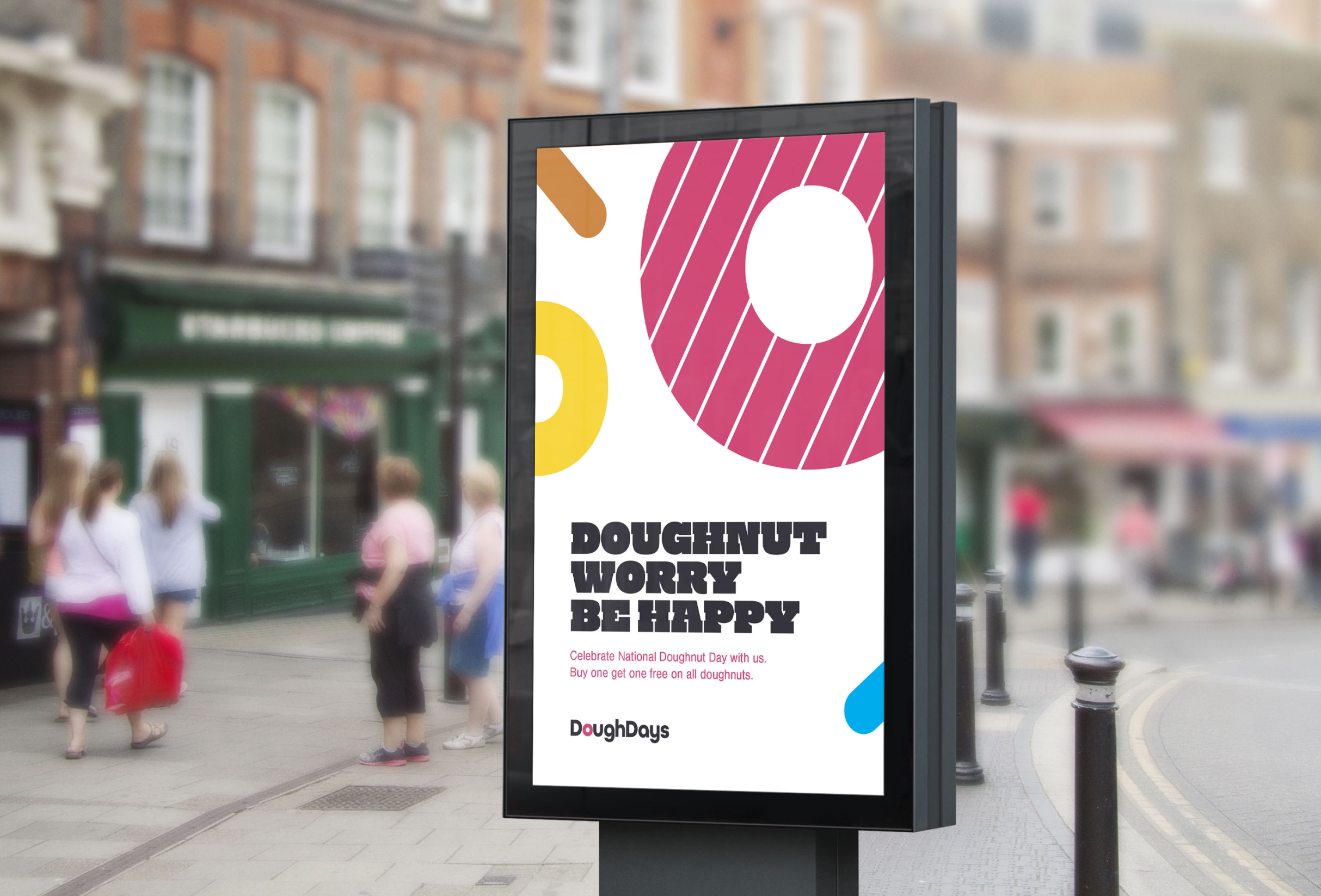
Who doesn’t love fresh doughnuts?! JUMP’s Head of Design Andy certainly does! Inspired by baking at home with his kids and the fact that shop-bought doughnuts just aren’t as fresh and tasty, the Doughdays bakery was born; a brand inspired by fresh doughnuts that are available every day.
The shape of the ‘o’ and simple lines represent this tasty sweet treat and is complemented by bold, vivid colours and a supporting strapline of ‘fresh doughnuts everyday’.
Conclusion
Every brand designer’s creative process is different and we can often get trapped by our own thinking by using familiar ways of working. This means we fail to see other options. But the Creative Challenge allowed our designers to question “what if?” and embrace a different, new perspective to branding design. Often in an office environment, everyday tasks can interfere – emails, admin, answering the door to the postman – but breaking routine and doing something new can allow creative juices to flow. Exercising a little imagination and a lot of fun made the challenge a huge success!
Blog by Hannah Fawcett, Jump. This article originally appeared on JUMP’s blog at https://www.wesayhowhigh.com/blog/article/creative-challenge
Address
Coronation House, 65 Quayside, Newcastle Upon Tyne, NE1 3DE
Telephone
07955289085
Connect with Generator
© Generator 2025 - All rights reserved.
Delivered with Cargo Creative


